
Once you know what to say to an injured worker, you have to decide how to package it. Video or image? Polished or shot on a phone? Fifteen seconds or forty-five? These aren’t cosmetic questions — the format changes who stops scrolling, how much of your message lands, and what a signed case ends up costing. Here’s how the formats differ for a workers’ comp firm, and how to build one that actually signs cases.
The three formats and what each does
Meta gives you a handful of formats, but three do almost all the work for a workers’ comp firm. Each has a job it’s best at.
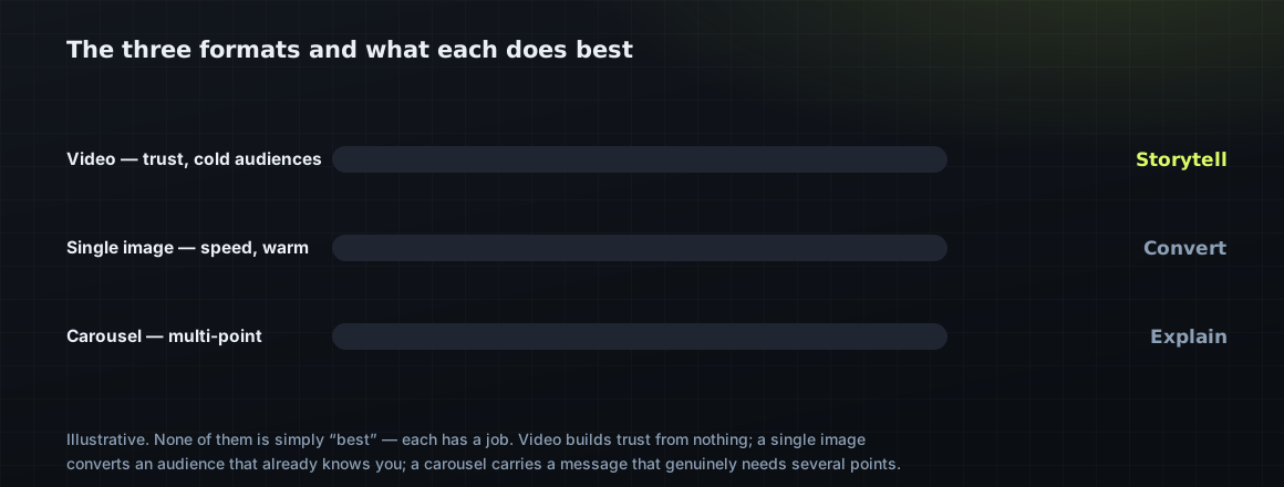
Notice none of them is simply “best.” A cold audience that’s never heard of you usually needs video to build enough trust to act; a warm retargeting audience that already knows you may sign faster off a single image with a clear call to action. The format follows the job.
The reason none of them is simply “best” is that a format is a delivery vehicle, and the right vehicle depends on the cargo and the road. A cold audience that has never heard of your firm needs the trust-building that only video really delivers — a face, a voice, a few seconds of feeling understood. A warm audience that already engaged doesn’t need that build; it needs a clear reason to act now, which a single sharp image delivers faster than a thirty-second video the person doesn’t have the patience to rewatch. The carousel earns its place only when a single message genuinely has several parts — the steps of a claim, a short proof sequence, a few case types — and even then, most of the attention lands on the first card.
This is why “which format works best for workers’ comp ads” is the wrong question, and why the confident one-format answers you’ll hear are a warning sign. The firms that win run a mix, matched to where each audience is, and let cost per signed case — not which format looked most impressive in the ad account — settle it. A format is a tool; the skill is knowing which job each one is for.
There’s a production-cost angle worth weighing, too. Video is the most expensive format to make well and the most powerful cold, which tempts firms to either overspend on it or avoid it entirely — both mistakes. The pragmatic path is to make video cheaply and often (an attorney on a phone camera answering real questions), reserve real production budget for the few concepts that prove out, and lean on single images and simple carousels for the warm-audience and retargeting work where they convert as well or better at a fraction of the cost. Matching format to job isn’t only about performance; it’s about spending your creative budget where it actually changes the outcome.
The first three seconds decide everything
On a feed that moves at a thumb-flick, your ad has about three seconds to earn the next three. This is truest for video, where a slow open is a dead ad — but it applies to every format. The hook has to name the person (“Hurt on the job?”), the problem (“Claim denied?”), or the outcome (“You may be owed more than they offered”). Anything that opens with your logo, your firm name, or a slow establishing shot has already lost most of the people it was paid to reach.
Most workers’ comp ads die in the first three seconds — not because the offer is weak, but because the opening asked the viewer to be patient. On Meta, patience is the one thing no one has.
Spencer Moeller, WorkersComp MarketingThe three-second rule is the single most violated principle in legal advertising, and fixing it is often the cheapest performance gain available. Watch a batch of workers’ comp ads and you’ll see the same mistakes: a slow logo animation, an establishing shot of a building, an attorney introducing themselves by name before saying anything the viewer cares about. Every one of those openings spends the most valuable three seconds you have on something the injured worker has no reason to watch. By the time the ad gets to “and if you were hurt at work,” the person is already three videos down the feed.
The fix costs nothing but discipline: front-load the hook. The first frame should name the person (“Hurt on the job?”), the problem (“Claim denied?”), or the outcome (“You may be owed more than they offered”). Say the thing that makes your exact buyer stop, and say it first — the logo, the firm name, and the credentials can all come later, once you’ve earned the attention to show them. An ad that wins the first three seconds gets a chance to win the case; an ad that opens on its own branding has already lost most of the people it paid to reach.
A useful discipline is to watch your own ads the way your audience will: on a phone, with the sound off, thumb ready to scroll. Sound-off matters because a large share of feed video is watched muted, which means your hook has to work as text or as a visually obvious situation, not as a spoken line. If the first frame doesn’t communicate “this is about a hurt worker” without audio — through an on-screen caption, a clear visual, or a bold opening line — you’re relying on a soundtrack most people never hear. Design the opening to land silent, and it will land far more often.
Polished vs. authentic
Here’s the counterintuitive part: the glossy, high-production ad often loses to something that looks like it was shot on a phone. Injured workers are wary of slick lawyer advertising — it reads as expensive, distant, maybe not for people like them. A plainspoken, authentic clip — an attorney talking straight to camera, or real-feeling footage — often earns more trust and more signed cases than a polished spot that cost ten times as much to make.
This is why video content for WC firms and even organic social feed your paid ads: the authentic clips that perform organically are often your best paid creative, already proven.
The polished-versus-authentic question trips up firms with budget, because the instinct when you can afford production is to use it. But injured workers have a finely tuned radar for slick lawyer advertising — it reads as expensive, distant, and maybe not for people like them. A plainspoken clip of an attorney answering one real question, shot on a decent phone in good light, frequently outperforms a spot that cost ten times as much, because it feels like a person rather than a billboard. Authenticity isn’t a budget constraint dressed up as a virtue; it’s often the actual winning creative, and it has the enormous practical advantage that you can make more of it cheaply the moment it works.
None of this means production quality never matters — a video so shaky or poorly lit that it’s hard to watch will lose people regardless of how authentic it feels. The bar is “clear and human,” not “cinematic.” Good light, steady framing, clean audio, and a real person saying something true will beat both a phone video that’s genuinely hard to watch and a glossy spot that feels like an insurance commercial. Authenticity and basic competence aren’t in tension; the winning creative is usually a real person, shot simply but well, saying something an injured worker actually needs to hear.
The anatomy of an ad that signs cases
Whatever the format, the ads that convert share a structure. Not a rigid template — a sequence that respects how a scared, hurting person decides to call a lawyer.
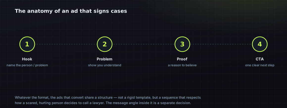
The message angle inside that structure — the specific promise that makes an injured worker act — is its own decision, covered in the three creative angles that sign cases. Format is how you deliver the angle; the angle is what you’re delivering.
The anatomy is a sequence, not a script, and the difference matters. You’re not filling in a template; you’re respecting the order in which a scared, hurting person decides to trust a stranger with their case. First they have to feel seen — that’s the hook and the problem. Then they need a reason to believe you specifically can help — that’s the proof, whether it’s a result stated within the rules, a review, or a plainly stated fact about their situation. Only then does the ask land, and the ask should be one clear, low-commitment step: “find out what your claim is worth — free,” not “call now for a consultation and bring your documents.” Get the order right and even a simple ad converts; get it wrong and even a beautiful one doesn’t.
The call to action deserves a second look, because it’s where firms accidentally raise the friction they spent the whole ad lowering. “Call now for a free consultation” asks a scared person to pick up the phone and talk to a stranger — a big ask. “See what your claim may be worth” or “Get your questions answered — free” asks for something smaller and less intimidating, and lets the relationship start on the person’s terms. The ask should be the easiest possible next step consistent with capturing a real lead, because every ounce of commitment you demand in the CTA costs you some of the people the rest of the ad worked to win.
How long, and how many
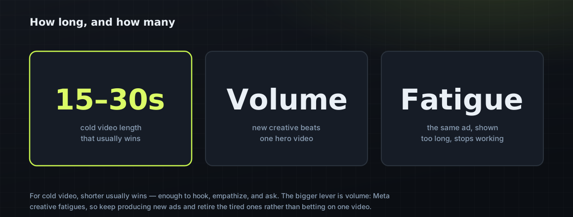
For cold video, shorter usually wins — fifteen to thirty seconds is plenty to hook, empathize, and ask. Longer can work when the story earns it, but every extra second is a chance to lose the viewer. The bigger lever, though, isn’t length — it’s volume. Meta creative fatigues: the same ad shown too long stops working as the audience saturates. Firms that win produce new creative continuously and retire the tired ones, rather than betting the account on one hero video.
And you can’t tell winners from losers by taste — you need enough data to know the difference, which is where most firms fool themselves. The sample-size problem that makes most ad tests coin flips is in most workers’ comp ad tests are coin flips.
Volume is the lever firms underestimate most, because it’s less fun than chasing the perfect ad. Meta creative fatigues: run the same ad against the same audience long enough and performance decays as the audience saturates and starts scrolling past something they’ve seen five times. The firms that scale on Meta treat creative like a renewable resource — a steady stream of new hooks and formats entering while tired ones retire — rather than betting the account on one hero video and wondering why it stopped working in week six. You don’t need every ad to be great; you need to always have the next few in testing, because the account’s health depends on freshness as much as on quality.
Length follows the same match-to-audience logic as format. Cold video usually wins short — fifteen to thirty seconds is enough to hook, show you understand, and ask — because a cold viewer hasn’t earned a reason to give you more. Longer can work when the story genuinely holds attention, a real client’s account of a denied claim that turned around, for instance, but every added second is another chance to lose the viewer, so length has to be earned, not assumed. For warm audiences, shorter still: they know you, so a five-to-ten-second reminder with a clear ask often outperforms anything longer. When in doubt, cut it down.
Match format to funnel stage
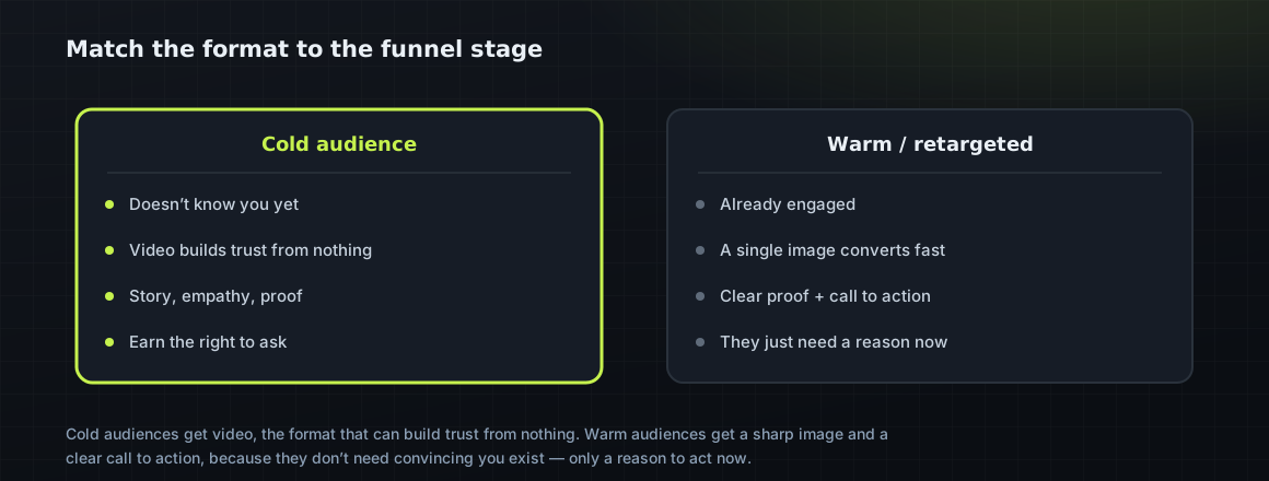
Pull it together and the format choice gets simple. Cold audiences who don’t know you get video — the format that can build trust from nothing. Warm audiences who’ve engaged get a single image or short clip with a sharp call to action, because they don’t need convincing that you exist, only a reason to act now. Carousels earn their place when a single point genuinely needs several — the steps of a claim, a few case types, a short proof sequence. Match the format to where the person is, feed the account fresh creative, and judge all of it by cost per signed case.
The funnel logic also tells you what to make next when you’re out of ideas. If your cold video is working but you’re not converting the warm audience, you don’t need another cold video — you need retargeting creative: a proof-forward image, a short testimonial, a clear CTA aimed at people who already engaged. If you’re converting warm but starving for new people, you need more top-of-funnel video with strong self-selecting hooks. Reading the account by stage turns “we need more creative” from a vague chore into a specific brief, and specific briefs produce better ads faster than a general demand for “something new.”
The format mistakes that waste spend
A handful of format errors quietly drain workers’ comp ad budgets. The most common is opening every ad on the firm’s logo or name — burning the three seconds that decide whether anyone watches. The second is over-producing: spending real money on a glossy spot before testing a cheap authentic one that would have beaten it. The third is running a single format for everyone, sending the same thirty-second video to a warm audience that just needed an image and a link, or a static image to a cold audience that needed a story to trust you at all.
The fourth is betting on one piece of creative and letting it run until it dies, with nothing in the pipeline to replace it — so performance falls off a cliff and the firm concludes “Meta stopped working” when the real problem was creative fatigue with no bench. And the fifth is judging any of it by the wrong number: a video with a great view rate or a huge reach can still produce zero signed cases, and a plain image that few people “liked” can quietly be your best case-producer. Watch cost per signed case, not vanity engagement, and let it tell you which creative and which format actually earned their spend.
None of this is complicated, which is the point. Win the first three seconds, favor authentic over polished until the data says otherwise, structure every ad as hook-problem-proof-CTA, match the format to where the audience is, keep fresh creative flowing, and measure the whole thing in signed cases. Do that and the format question stops being a mystery and becomes a set of deliberate choices — each one aimed at the same target as everything else in your marketing: an injured worker who stops scrolling, feels understood, and decides to call.
Format, in the end, is downstream of the two things that actually decide a Meta account: whether the message speaks to an injured worker, and whether the intake behind it catches the leads the ad produces. A perfect format wrapped around a generic message won’t sign cases, and the best ad in your market is wasted if the call it generates goes to voicemail. Get the message right, build the intake to answer fast, then use format the way this guide describes — as a set of deliberate choices matched to the audience and measured in signed cases. Do all three and Meta becomes what it’s supposed to be for a workers’ comp firm: a reliable, controllable source of injured workers who needed a lawyer and found you first.
The habit that separates firms who win on Meta from firms who churn through agencies is a creative habit, not a targeting one. Set up a simple rhythm: keep a running list of angles injured workers respond to, turn one into a fresh ad every week, watch which ones produce qualified leads and signed cases, and retire the rest without ceremony. Most will be ordinary; a few will carry the account. You don’t need a studio or a big budget to run this — an attorney, a phone, good light, and something true to say is enough to start. Do it consistently and you’ll always have the next few ads in testing, which on modern Meta is the whole game, because the creative is the targeting and fresh creative is what keeps the account alive.
Key takeaways
-
Format is a decision, not a default. Video, image, and carousel each do a different job; pick by funnel stage, not by habit.
-
The first three seconds decide everything. If the opening does not stop the scroll, nothing after it matters.
-
Authentic usually beats polished. Phone-shot, real-feeling creative outperforms glossy production for injured-worker trust.
-
The signing ad has an anatomy. Hook, worry, proof, and a clear next step, in that order, turn a view into a form.
-
Most format waste is a mismatch. Running the wrong format for the funnel stage is the quiet budget leak.
Frequently asked questions
What is the best Meta ad format for workers’ comp firms?
There’s no single best format — each has a job. Video builds trust with cold audiences who don’t know you; a single image converts warm audiences fast; carousels carry a message that needs several points. Run a mix, match the format to where the person is in your funnel, and judge by cost per signed case.
Does video or image work better for workers’ comp ads?
Video usually wins for cold audiences because it can build trust from nothing, while a single image converts better with warm, retargeted audiences that already know you and just need a clear call to action. Most accounts run both, matched to the audience’s stage.
Should workers’ comp ads be professionally produced?
Often not. Injured workers are wary of slick lawyer advertising, and a plainspoken, phone-shot clip of an attorney answering a real question frequently earns more trust and more signed cases than a polished spot that cost far more to make. Test authentic creative before investing in production.
How long should a workers’ comp Meta video ad be?
For cold audiences, fifteen to thirty seconds is usually plenty to hook, empathize, and ask. Longer can work when the story earns it, but every extra second risks losing the viewer. The bigger lever is creative volume — keep producing new ads because Meta creative fatigues as the audience saturates.
What makes a Meta ad sign workers’ comp cases?
A structure that respects how a scared, hurting person decides to call a lawyer: a hook in the first three seconds that names the person or problem, a section that shows you understand and gives a reason to believe, and one clear low-commitment call to action. The message angle inside that structure is a separate decision.
Sources & further reading
-
01
Meta ad format documentation
Meta for Business documents the ad formats, specs, and placements behind each creative decision.
- 02
Platform rules and benchmarks change over time; confirm current details in the platform’s own documentation. General marketing information, not legal advice.