
Most workers’ comp firms think of their website as a box they checked years ago. It exists, it has the firm name and a phone number, an agency built it once, and it has not been seriously reconsidered since. Meanwhile the firm pours money into ads, search, and referrals — every one of which dumps its hard-won traffic onto that same neglected site and hopes for the best. The website is treated as scenery. It is actually the stage.
Here is the uncomfortable structural truth: your website is the one thing every other channel depends on. A brilliant ad that sends an injured worker to a slow, confusing, untrustworthy page is a wasted ad. A number-one Google ranking that lands on a site that does not answer the worker’s question is a wasted ranking. A referral who looks you up before calling and finds a broken, dated site is a referral you may lose. The site does not just sit alongside your marketing — it multiplies or divides all of it. Improve it and every channel gets cheaper at once; neglect it and every channel quietly pays a tax you never see on a report.
This article is what a workers’ comp firm’s site actually needs to sign cases, in order: why the site is the hinge rather than a brochure, the real question the injured worker is asking in the first ten seconds, the practice page most firm sites are missing, why it has to be built for a phone in a parking lot, what site speed does to sign rate, how the site doubles as your SEO foundation, the conversion essentials every page needs, and a thirty-day triage that fixes the highest-value things first. None of it is about looking impressive. All of it is about doing a job.
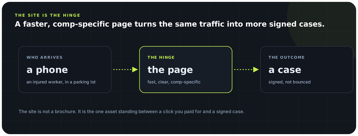
The hinge, not the brochure
Every channel you run ends at the same place. That place is either multiplying your marketing or quietly dividing it.
Picture where all your marketing actually leads. The Meta ad, the Google search, the Local Services Ad, the referral from a past client, the doctor’s recommendation, the billboard someone half-remembers and searches for later — every one of those paths ends at your website. It is the single shared destination of an entire marketing operation, which makes it the highest-leverage page in the business and the one most firms think about least. A firm will happily spend months tuning ad creative while the page that receives every click has not been touched in three years.
Because the site is shared infrastructure, its quality is not a local problem — it is a systemic one. A ten-percent improvement in how well the site converts is not a ten-percent improvement to one campaign; it is a ten-percent lift applied to every channel simultaneously, because they all pour through the same funnel. That is why the website is usually the highest-return marketing project a firm can undertake, and also the most commonly skipped: it is nobody’s campaign, so it is nobody’s job.

Those three jobs — be found, be believed, be easy to contact — are the whole standard against which a workers’ comp site should be judged. Notice what is not on the list: be beautiful, be clever, be original. Design matters only in service of the three jobs. A gorgeous site that buries the phone number is failing; a plain one that loads instantly, reassures an anxious worker, and puts a call one tap away is succeeding. Throughout this article, every recommendation traces back to one of those three jobs, because a website that does them is a website that signs cases, whatever it looks like.
The worker’s real first question
An injured worker landing on your site is not admiring your design. In the first seconds they are asking one anxious question — and your site is answering it whether you meant to or not.
When an injured worker arrives on your site, they are frightened, in pain, possibly worried about their job, and almost certainly on their phone. They are not evaluating your brand palette. They are asking, in the space of a few seconds, a single loaded question: is this a real firm that handles exactly my problem, and can I trust it? Everything on the page either answers that question reassuringly or fails to — and a site that fails to answer it loses the worker to the next firm regardless of how much you paid to get them there.
What answers the question is trust made visible, fast. Real photographs of real attorneys, not stock images of gavels. Specific results and honest reviews that say other injured workers were helped. Plain language that names the worker’s situation — a denied claim, a stopped check, an employer pushing back — so they feel seen rather than sold to. The absence of these is felt even when it is not consciously noticed; a site that is all slogans and no proof reads as hollow to exactly the person you most need to reassure.

The tone that wins here is calm competence, not urgency. An injured worker does not need flashing banners and countdown timers; they need to feel that calling this firm will make their frightening situation simpler and safer. A site that projects steadiness — we handle exactly this, we have helped people like you, here is how easy it is to talk to us — converts the anxious visitor far better than one shouting for attention. You are not trying to excite them. You are trying to relieve them.
The comp page most sites are missing
A dedicated workers’ comp page is the difference between a firm that clearly handles your problem and one that lists it among ten others.
Here is a gap that shows up on a startling number of law-firm sites: there is no real workers’ compensation page. Comp appears as one bullet in a “practice areas” list, linking to a thin paragraph, sandwiched between personal injury and family law. To an injured worker, that reads as “we do a little of everything,” which is the opposite of what a frightened person wants. They want a firm that clearly, primarily, confidently handles workers’ comp — and a single generic bullet does not say that.
A proper workers’ comp page does several jobs at once. It tells the anxious worker they are in the right place by speaking directly to their situation. It gives Google a substantial, focused page to understand and rank for comp searches, rather than asking a thin bullet to compete. And it becomes the natural destination for your comp-specific ads and Local Services Ads, so the money you spend chasing comp cases lands on a page actually built for comp cases instead of a generic homepage. One focused page quietly improves trust, search, and paid conversion at the same time.
The page should answer the questions a real injured worker has — what the process looks like, what it costs to hire you, what happens if the claim was denied, whether they can be fired for filing — in plain, reassuring language, backed by proof that you win these cases. This is also where your site starts to become a content hub rather than a pamphlet: the comp page anchors a cluster of supporting articles and guides that deepen both trust and search visibility, which is exactly the structure that local SEO and content reward.
Built for a phone in a parking lot
The injured worker is not at a desk. They are on a phone, one-handed, in a waiting room or a parking lot — and most law-firm sites are still quietly designed for a monitor.
The single most important fact about your website’s audience is where they are sitting when they use it: they are not at a desk. An injured worker is on a phone, often one-handed, frequently in a doctor’s waiting room, a pharmacy line, or a car outside the job that hurt them. They are distracted, uncomfortable, and impatient. A site designed first for a big desktop screen and then shrunk down for mobile is designed for the wrong person — and that describes a large share of law-firm sites, which were built desktop-first and treat the phone as an afterthought.
Phone-first design changes concrete things. The phone number has to be a tappable button that dials, present without scrolling, not a string of text a person has to memorize and re-key. Buttons and tap targets have to be big enough for a thumb. Forms have to be short, because typing on a phone in pain is miserable and every extra field loses people. The most important content — who you are, that you handle comp, and how to call — has to be visible immediately, not buried under a giant header image that eats the whole first screen. These are not aesthetic preferences; they are the difference between a worker who calls and one who gives up.
It is worth actually doing what the worker does: pull up your own site on your phone, one-handed, and try to call the firm in under five seconds without pinching, zooming, or scrolling. If you cannot, neither can an injured worker — and the ad or search result that sent them cost you money to earn a visit they just abandoned at the door.
What speed does to sign rate
A slow site does not just frustrate visitors — it loses them before the page even finishes loading, and it quietly lowers your search rank too.
Speed is the most underrated conversion lever on a law-firm site because its damage is invisible. When a page loads slowly, the visitors who leave during the wait are simply gone — they never appear in your analytics as a rejection, they just never became anything. You paid to send an injured worker to your site and lost them in the blank seconds before your content appeared, and nothing on any report tells you it happened. A firm can spend months optimizing a page that a meaningful share of its visitors never actually see finish loading.
The impatience is sharpest in exactly this audience. An injured worker in pain, on a phone, with several other firms one back-button away, does not wait politely for a heavy page to assemble itself. Every second of load time is a moment for them to give up and tap the next result. And because these are people you often paid to acquire, a slow site is not merely losing free traffic — it is pouring paid clicks into a page that drops them before they arrive. The cost is real even though it never shows up as a line item.
Speed also compounds into search. Google uses page experience, including how quickly and smoothly a page loads on mobile, as a factor in rankings — so a slow site is penalized twice, losing visitors who do arrive and ranking lower so fewer arrive at all. This is the through-line to the site’s other great role, the one most firms never connect to their marketing: the website is not just where traffic lands, it is the foundation the search channel is built on.
The site as your SEO foundation
Ads rent attention; the day you stop paying, they stop. Your website, done right, earns attention that compounds — but only if it is built to be found.
Every other channel in this playbook is something you rent. Stop paying and the ads stop, the leads stop, the phone goes quiet. Your website is the one marketing asset you own, and when it is built well it does something rented channels never do: it earns free, compounding visibility through search. An injured worker who finds you by searching — rather than by clicking an ad you paid for — costs you nothing for that click, and the pages that earn those searches keep earning them month after month. But that only happens if the site is built to be found, and most are not.
Being found starts with the structure the site gives Google to work with. A clean, logical site with a real workers’ comp page, supporting articles that answer real questions, and the local signals that tell Google where you practice is a site Google can understand and rank. A thin site — a homepage, a bullet list of practice areas, a contact form — gives the search engine almost nothing to work with, so it earns almost nothing back. The site does not have to be enormous; it has to be substantial and organized around what injured workers actually search for.
This is where the website stops being a single page and becomes a system: a strong comp page anchoring a cluster of genuinely useful content, all fast and mobile-friendly, all reinforcing that you are the firm that handles exactly this. That structure is what earns the map pack and the organic rankings covered in the local SEO guide and the reviews playbook — and it is why the website is not a project you finish, but the foundation everything else compounds on. Rented channels reset to zero when the budget stops; an owned, well-built site keeps working.
What every page needs to sign a case
A beautiful site that does not convert is an expensive brochure. A plain one built around a few conversion essentials signs cases every week.
Strip away the aesthetics and a case-signing page comes down to a handful of non-negotiables, each tied to one of the site’s three jobs. There is one clear next step — call now, or a short form — not five competing buttons that split the visitor’s attention until they take none of them. There is trust in view: results, reviews, real faces, near the top where the anxious worker meets it first. There is a phone number that is always reachable and always tappable. And there is a promise the site can keep, landing the worker where the ad said it would and making the very next action effortless.

The most common self-inflicted wound is the page that competes with itself. A homepage with a rotating slider, four equally-weighted buttons, a chat widget, a newsletter popup, and a menu of ten practice areas gives the injured worker too many choices and, paradoxically, guarantees they make none. Clarity converts. A page that knows its one job — get this worker to call about their comp case — and removes everything that competes with that job will out-sign a busier, prettier page every time. This is the same one-CTA discipline that governs a good landing page, applied to the whole site.
And behind every conversion element is an assumption that has to hold: that the call actually gets answered. A site can do everything right — load fast, reassure, make calling one tap — and still waste it all if the phone rings into voicemail. The website’s job is to turn a visitor into a call; speed-to-lead and the intake call are what turn that call into a signed case. The site is the first link in that chain, and a strong first link into a weak second one still drops the case.
A 30-day site triage
You do not need a full rebuild to start signing more cases. You need to fix the highest-value things first, in order.
Most firms hear “your website needs work” and imagine an expensive, months-long rebuild — so they do nothing. That is the wrong frame. The highest-value fixes are usually small, specific, and independent of any redesign, and doing them in order of return means the firm starts signing more cases in the first week rather than the sixth month. The point is not a perfect site; it is a site that stops leaking the traffic you already pay for.

Walk it in order. First, mobile load speed, because the fastest win is not losing visitors who never see the page. Next, tap-to-call everywhere, because an injured worker who wants to call and cannot easily is the cheapest case a firm throws away. Then a real workers’ comp page, so the worker knows they are in the right place and Google has something to rank. Then trust proof moved up where the anxious visitor meets it first. Then one clear call to action per page, so the site stops competing with itself. Only after those are handled does a cosmetic redesign earn its place — and by then it is a polish on a site that already works, not a rescue of one that does not.
| Priority | Fix | Why it ranks here |
|---|---|---|
| 1 | Mobile load speed | Recovers visitors lost before the page appears |
| 2 | Tap-to-call, always in reach | The easiest signed case most firms are dropping |
| 3 | A dedicated workers’ comp page | Reassures the worker and earns search visibility |
| 4 | Trust proof near the top | Answers the worker’s real first question fast |
| 5 | One CTA per page | Stops the site from competing with itself |
The firms behind this playbook — roughly $16.5M in managed spend, 219,000 leads at about $75 each, and 21,000 signed cases — consistently found the same thing: the website was where the cheapest gains hid, because a fix there lifted every channel at once. A firm does not need an award-winning site to grow. It needs one that loads fast, tells an injured worker they are in the right place, proves it, and makes calling a single tap. Do that, and the same ads, the same rankings, and the same referrals all start signing more cases — because the hinge they all swing on finally holds.
Key takeaways
-
The website is the hinge, not the brochure. Every channel you run ends at the site; if it cannot sign, nothing upstream matters.
-
Answer the worker’s real first question. Most comp sites never address the one thing an injured worker actually wants to know.
-
Most sites are missing the comp page. A dedicated, honest workers’ comp page is the single most common gap.
-
Built for a phone in a parking lot. Your visitor is on mobile, stressed, and one-handed; design for that, not for a desktop.
-
Speed moves sign rate, and SEO. A fast site converts better and ranks better; the two fixes are the same fix.
Frequently asked questions
What makes a good workers’ comp law firm website?
A good one does three jobs: it is found (Google can read and rank it, with a real workers’ comp page and local signals), it is believed (an anxious injured worker sees results, reviews, and real faces and trusts it), and it is effortless to contact (tap-to-call in reach, one clear next step, a short form, and it loads fast on a phone). Design matters only in service of those three jobs — a plain site that does them signs more cases than a beautiful one that does not.
Why is my website more important than my ads?
Because every ad, search result, and referral lands on it. The website is shared infrastructure for your whole marketing operation, so its quality multiplies or divides everything else. A ten-percent improvement in how well the site converts lifts every channel at the same time, which is why fixing the site is usually the highest-return marketing project a firm can do — and the most commonly skipped, because it is nobody’s individual campaign.
Do I really need a separate workers’ comp page?
Yes. If comp is just one bullet in a practice-areas list, an injured worker reads it as “we do a little of everything,” and Google has only a thin page to rank. A dedicated workers’ comp page reassures the worker that you handle exactly their problem, gives the search engine a substantial page to rank for comp searches, and gives your comp ads a real landing page instead of a generic homepage — three wins from one page.
How much does site speed actually matter?
A great deal, and invisibly. Visitors who leave while a slow page loads never show up as a rejection in your reports — they simply never became anything, and you often paid to send them there. Injured workers on phones are especially impatient, with the next firm one tap away. Speed also feeds search rankings, so a slow site is penalized twice: it loses visitors who arrive and ranks lower so fewer arrive at all.
Should I do a full redesign or fix things one at a time?
Fix the highest-return things first; a full redesign is usually the wrong place to start. The biggest gains — mobile speed, tap-to-call, a real comp page, trust proof near the top, one clear call to action per page — are small, specific, and independent of any rebuild, and doing them in order of return starts signing more cases in the first week. A cosmetic redesign earns its place only after the site already works.
Is my website part of my SEO?
It is the foundation of it. Search is the one channel you own rather than rent, and it compounds — but only if the site is built to be found. That means a clean structure, a substantial workers’ comp page anchoring a cluster of genuinely useful content, local signals, and fast mobile pages. A thin site of a homepage and a contact form gives Google almost nothing to rank, so it earns almost nothing back from search.
Sources & further reading
- 01
- 02
- 03
Benchmarks here draw on WorkersComp Marketing’s own managed-spend data across live firms; your numbers will differ. General marketing information, not legal advice.