Your ad’s only job is to earn the click. From that instant, the landing page is your entire sales pitch — and most firms hand it to a homepage that was never built to sell.
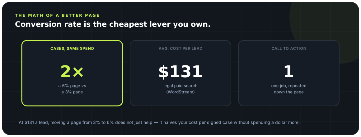
Legal is the most expensive category in paid search, with an average cost per lead around $131. When each click costs that much, a page that converts at 6% instead of 3% doesn’t just help — it halves your cost per case. The landing page is the highest-leverage surface in your whole funnel.
This piece breaks a signing page into its parts — headline, hero, form, trust, proof, and CTA — and the mobile and speed fundamentals that decide whether any of it ever loads.
Why your homepage loses cases
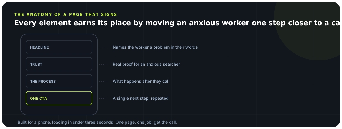
A homepage is a lobby. A landing page is a handshake.
Your homepage is built to serve everyone — existing clients, job seekers, referral sources, the curious. It has a full navigation bar, a dozen links, and no single next step. That’s fine for a lobby. It’s terrible for a paid injured-worker click who needs to know, in three seconds, “can this firm help me and what do I do next?”
Every extra link on the page is an exit. A landing page strips the navigation, kills the distractions, and points the visitor at one action. Same ad, same click cost — dramatically different odds of a signed case, purely because the destination has a job and does it.
The anatomy of a signing page
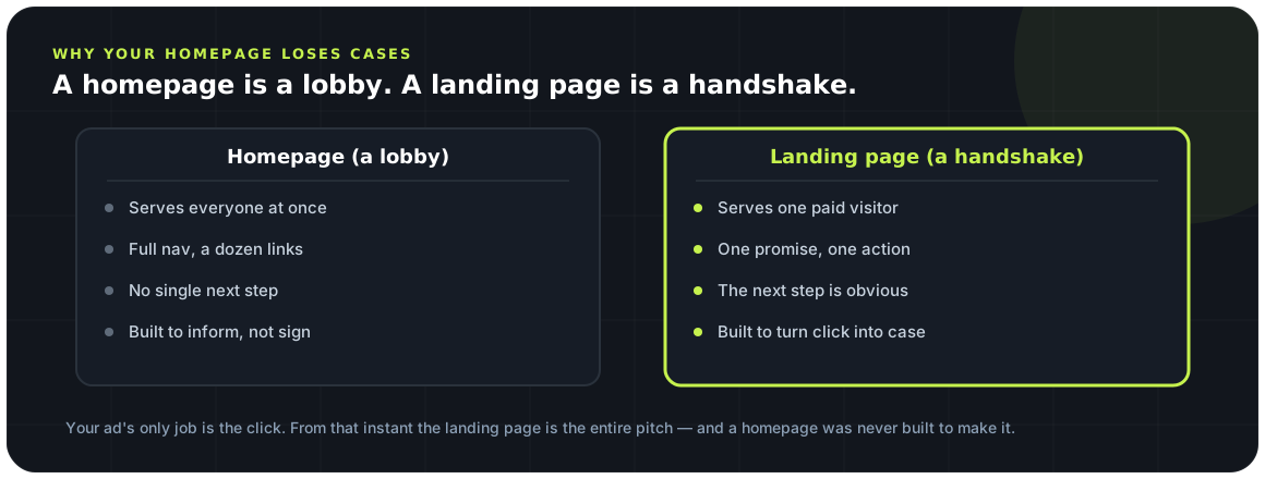
Six blocks, in order, each doing one thing.
1. The headline — one clear promise
The headline is 80% of the page. It should name the visitor’s situation and the outcome they want in plain words: “Hurt at Work? Find Out What Your Claim Is Worth — Free.” Speak to the injured worker, not to other lawyers. No Latin, no firm-name-first vanity, no jargon.
2. The hero — promise, subhead, action, all above the fold
Directly under the headline: one supporting line that removes the biggest fear (cost), and the contact action — visible without scrolling, especially on mobile. An injured worker should be able to reach you before they scroll a pixel.
3. The form (or call button) — short and reachable
Ask for the minimum: name, phone, and a one-line “what happened.” Every extra field costs you conversions. On mobile, a tap-to-call button often beats a form — many injured workers would rather talk than type. Offer both, and make the primary one impossible to miss.
4. The “why us / why act” block
Three to five short reasons to choose you and to act now: no fee unless you win, free case review, workers’ comp focus, fast response. Bullets, not paragraphs. This is reassurance, not a brochure.
5. Social proof
Reviews, star ratings, results, and recognizable trust marks. An injured worker is scared of being taken advantage of; proof that real people trusted you and were treated well does more than any adjective you could write about yourself.
6. The repeat CTA
Close with the same call to action you opened with. A visitor who reaches the bottom is interested — don’t make them scroll back up to act. One consistent CTA, repeated, beats a page that offers five different things.
| Homepage | Landing page | |
|---|---|---|
| Navigation | Full menu (many exits) | Stripped — no distractions |
| Message | Serves everyone | One audience, one promise |
| Next step | Unclear / many | One obvious action |
| Above the fold | Brand and menu | Promise + contact action |
| Built to | Inform | Convert |
Trust signals for anxious searchers
An injured worker is scared. The page’s real job is to make them feel safe.
Behind every workers’ comp click is a person who is hurt, worried about money, and often unsure whether they can even afford a lawyer. Conversion here is less about persuasion and more about reassurance. The trust signals that matter most:
Other quiet trust builders: a real photo of the actual team (not stock), plain-language answers to “will I get fired for filing?”, and a clear statement that the consultation is free and confidential. For campaigns aimed at Spanish-speaking workers, a fully Spanish page — not a translated afterthought — converts far better.
Mobile and speed: the silent killers
Most injured-worker traffic is on a phone, on data, out of patience.
The majority of paid social and search traffic for workers’ comp arrives on mobile — often on a phone, on cellular data, from someone who is not going to wait. Two things quietly kill these pages before the content ever gets a chance.
The first is speed. Every second of load time sheds visitors; Google’s own research has long put meaningful bounce increases on pages that take more than about three seconds to load. A heavy homepage full of scripts and sliders is exactly the wrong thing to serve a data-connection click.
The second is mobile layout. The contact action must sit within thumb’s reach, tap targets must be big enough to hit, text must be readable without pinching, and a tap-to-call button should dial in one touch. A form that requires zooming is a form that doesn’t get filled.
The one-CTA rule
Give a scared person one decision, not a menu.
The most common conversion leak after the homepage mistake is offering too many choices. “Call us, or fill this form, or download our guide, or read our blog, or chat” — every added option dilutes the one that signs cases. Confused visitors don’t choose; they leave.
Pick one primary action — usually “get a free case review,” delivered by call or short form — and make everything on the page point at it. Secondary options (like a phone number) can exist, but visually there should be one obvious next step, repeated top and bottom.
A landing page with one call to action isn’t limited — it’s focused. Every extra option is a small invitation to leave.
Spencer Moeller, WorkersComp MarketingGetting the page right is only half the job — the other half is answering the lead in five minutes once it comes in. A page that converts and an intake that responds fast are the two halves of turning paid clicks into signed cases; either one alone leaks. See how they fit the full system in the WC marketing playbook.
The conversion checklist
Run every paid landing page against this before you spend a dollar sending traffic to it.
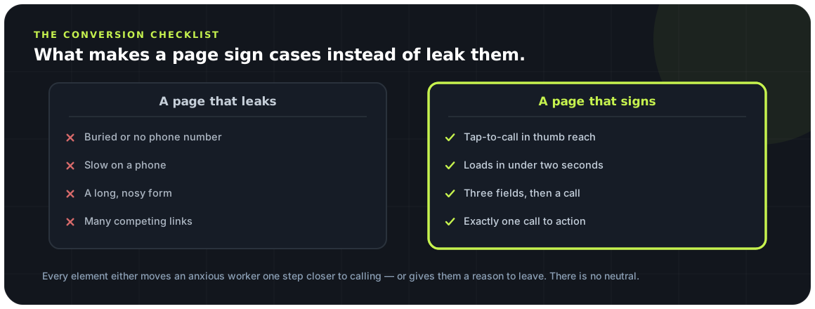
Key takeaways
-
Your homepage loses cases a landing page would sign. The ad earns the click; the page is the whole pitch, and a homepage is not built for it.
-
A signing page has an anatomy. One promise, proof, and a single next step, not a tour of the firm.
-
Anxious searchers need trust signals. Reviews, real faces, and plain answers lower the fear that stops a form.
-
Mobile and speed are the silent killers. Most injured workers arrive on a phone; a slow or clumsy page loses them before they read a word.
-
One page, one CTA. Every extra choice is a leak; give the visitor exactly one thing to do.
Frequently asked questions
Should I send ads to my homepage or a landing page?
Always a dedicated landing page. Your homepage serves many audiences and offers many exits; a landing page strips the navigation and points one visitor at one action. Sending premium-priced legal clicks to a homepage is the most common and expensive mistake in legal advertising.
What makes a workers’ comp landing page convert?
A single clear promise in the headline, the contact action above the fold on mobile, trust signals that reassure an anxious injured worker (no fee unless you win, real reviews, Spanish support), fast mobile load, and exactly one call to action repeated down the page.
How fast should a landing page load?
Aim for under about three seconds, tested on a real phone on cellular data. Most injured-worker traffic is on mobile, and every extra second of load time sheds visitors you already paid to acquire. A lighter, focused page almost always converts better than a heavy, beautiful one.
Should I use a form or a phone number?
Offer both, but make one primary. On mobile, a one-touch tap-to-call button often outperforms a form because many injured workers would rather talk than type. If you use a form, ask for the minimum — name, phone, and a one-line description — since every extra field lowers conversion.
Do I need a Spanish landing page?
For campaigns reaching Spanish-speaking injured workers, yes — and a fully Spanish page converts far better than a translated afterthought. A large share of the workers’ comp audience is more comfortable in Spanish, and a page that meets them there signals respect and lowers the barrier to reaching out.
Sources & further reading
-
01
Cost & conversion benchmarks
Industry CPC and conversion benchmarks that set the stakes for what a landing page has to convert.
- 02
External sources were accurate at publication and change over time; confirm current figures at the source. General marketing information, not legal advice.